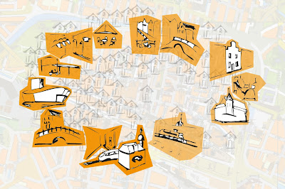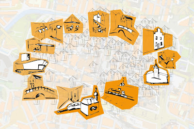


The contrast of the saturated orange color has the highest value at the bottom (where Delft station is visualized). For our eyes this is the first focus point and that is a strong aspect of the total image; from that point the image is 'read'. From this point a direction is chosen to follow the circular based route.

Hello group I
BeantwoordenVerwijderenThe buildings are nicely presented, but i did not get why you used the orange color this way. I think the poster, kind of lost the elegance of the first hand drawing you made. Maybe the important buildings can be more integrated with the background houses, because now they are really on top of the background while in reality they are in between the other houses.
No offense though :) A least you put everything in a perfect circle.. Maybe Waldo can guide you trough the Delft circle..
Hi group I
BeantwoordenVerwijderenThe change in orange color does show an orientation of direction.And the drawing style of buildings is interesting:)
The question is that the shopping spots and cultural spots are not very distinguishable at the moment.By reading each icon, it's still unclear what kind of spot it is.Maybe you can elaborate more on that for the next step.
good luck!
Thanx for you comments! :-)
BeantwoordenVerwijderenWe are playing a bit more with it now..
But about the regocnisability of the buildings... Our idea was to not let people being attracted by the meaning of these buildings, but let them unconsiously choose a direction, so not choosing for shops or culture. We thought if they would see more shops in one direction they could be tempted to choose for the right despite the visual pulls them to the left.
(understandable?) :-s
Understandable, but that's not the assignment!
BeantwoordenVerwijderenGroupT