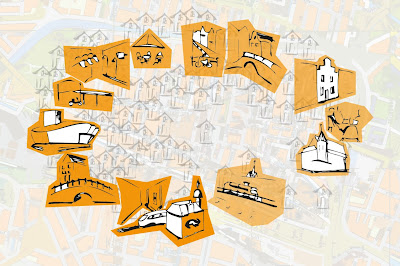
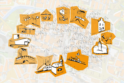
In this paragraph we will give an explaination about the whole process of Assignment 2.
We strated the assignment by diving into the description of the assignment and trying to get to understand the do's and dont's. We decided we all should draw our first idea and list the visual cues to be used from the previous assignment.
So we did, and we concluded that it would be something sketchy with visual qeues like gradient in color, size, ... AND, we had a strong feeling for creating something like a 'Where is Waldo' map. AND we agreed on the idea that the VISUAL CUES should lead the viewer, and not the actual contents, like the shops or museums. We thought that would distract the viewer and he would base his choises on that, despite the cues would lead him to the other direction.
We started drawing, buildings with a strong relation to the route, some visual cues, background.. and we started playing with it, making changes in size and background.
Than we got feedback and had to change some things, like the little houses, changing the gradient, adding blur...
And a brand new map was created!
We finally used the visual cues of gradient (one side is just a little bit vaguer than the other), blur (on one side the buildings have much less detail than on the other side), the direction of the train and last but not least, the people, as a symbol for 'where it is happening' (as one test person said).
The first concept got the feedback during the presentation that the houses in that way where not chaotic enough, the gradient with the orange areas was too strong and therefore not alowded, and we thought it was not clear enough that it had to do with a real route.
Choises have been made by talking about it together.
The testing was done by two of us, with two printed maps in The Hague. We asked diferent people if they would like to do this little test for us, IO TU Delft students. We asked them if they saw differences between the two maps and what these differences where. After that we showed them one of the two maps, explained the situation of going to a new city (Delft) and seeing this map on a billboard when leaving the trainstation, and asked which way they would go, to the right or to the left.
One of us was questioning and holding the papers, the other was filming and writing down the answers.
The results where very much in line with our assumptions in the biginning, but in the end they where different. All persons mentioned the people to be difference on the maps, and most people mentioned the blur and the train as well.
When they should mention to go to the left 64% of the test persons mentioned the left, and when they should mention to go to the right 78% of the test persons mentioned the right. Some people wanted to go to the crowded side, "this is where its happening" and others in contrast wanted to go to the more quite side..
So the results where quite promissing.
But unfortunately some people had problems with understanding that it was about a preset route, they wanted to go through the middle or they thought that they had to enter the city via the bridge.
We will explain about the several layers in the final design and why the viewer will be attracted to one side or the other....
We strated the assignment by diving into the description of the assignment and trying to get to understand the do's and dont's. We decided we all should draw our first idea and list the visual cues to be used from the previous assignment.
So we did, and we concluded that it would be something sketchy with visual qeues like gradient in color, size, ... AND, we had a strong feeling for creating something like a 'Where is Waldo' map. AND we agreed on the idea that the VISUAL CUES should lead the viewer, and not the actual contents, like the shops or museums. We thought that would distract the viewer and he would base his choises on that, despite the cues would lead him to the other direction.
We started drawing, buildings with a strong relation to the route, some visual cues, background.. and we started playing with it, making changes in size and background.
Than we got feedback and had to change some things, like the little houses, changing the gradient, adding blur...
And a brand new map was created!
We finally used the visual cues of gradient (one side is just a little bit vaguer than the other), blur (on one side the buildings have much less detail than on the other side), the direction of the train and last but not least, the people, as a symbol for 'where it is happening' (as one test person said).
The first concept got the feedback during the presentation that the houses in that way where not chaotic enough, the gradient with the orange areas was too strong and therefore not alowded, and we thought it was not clear enough that it had to do with a real route.
This made us change the background of the map, to something with more relation with the route in the city and something more Waldo-like (the houses in between the main buildings). (More below in this post you can read about the adjusted layers in the map in more detail.)Choises have been made by talking about it together.
The testing was done by two of us, with two printed maps in The Hague. We asked diferent people if they would like to do this little test for us, IO TU Delft students. We asked them if they saw differences between the two maps and what these differences where. After that we showed them one of the two maps, explained the situation of going to a new city (Delft) and seeing this map on a billboard when leaving the trainstation, and asked which way they would go, to the right or to the left.
One of us was questioning and holding the papers, the other was filming and writing down the answers.
The results where very much in line with our assumptions in the biginning, but in the end they where different. All persons mentioned the people to be difference on the maps, and most people mentioned the blur and the train as well.
When they should mention to go to the left 64% of the test persons mentioned the left, and when they should mention to go to the right 78% of the test persons mentioned the right. Some people wanted to go to the crowded side, "this is where its happening" and others in contrast wanted to go to the more quite side..
So the results where quite promissing.
But unfortunately some people had problems with understanding that it was about a preset route, they wanted to go through the middle or they thought that they had to enter the city via the bridge.
We will explain about the several layers in the final design and why the viewer will be attracted to one side or the other....
The viewer is guided by 2 levels:
- Direction of the train at the bottom;
- Density of people at the left/right side of the map.
To emphasize on the different directions, two extra layers were add after this. In the final images guidance is realized on 4 different levels:
- - Direction of the train;
- - Density of people;
- - Horizontal Blur of key-buildings, buildings and environment;
- - Horizontal color-gradient (white-transparent, opacity=20%)
without the people, blur and gradient it woul look like this
than we added the people
than we added the blur
than we added the gradient...
Well... which way would you go now????
And did you mention this one is different from the previous one in this post???


 Lautrec