After premiere crashing a 1000 times, we're finally on the role with the video!
"Can the fish kiss now?"
"Noooo!"
"Can the fish kiss now?"
"Yesssss!!"
donderdag 31 maart 2011
zondag 27 maart 2011
Moviemaking and testing
woensdag 23 maart 2011
dinsdag 22 maart 2011
work in progress
Hello lovely readers...
Of corse we are still working on the project...
After the presentation of last week tuesday we got the feedback that we shouldn't use a very obvious color gradient - that is a it too easy. And we could blur the houses to create direction. Besides, where is Waldo?
We have been playing with things like size, filling, background, and facing...
See the results:
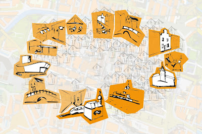
^ We changed the size of the buildings a bit, creating a gradient in size and we changed the facing of the front building to make a stronger line directing you to go right.
^ The background more maplike changes the perception, it makes it more clear that it has to do with a route, but the feeling of depth and distancy gets lost a bit
^ Playing with the sizes points the viewer to one side, in this case it should leed you to the left...
Did it work well?
^ To make the buildings a bit more conected and show that it is about a route we added some roads..
Do you think it works?
^ Well, we got the feedback to do some more with the houses... these were just some trials.. we will make them more beautiful and varied... more waldo-like, aproximately....
^ Something like this?
Goodbye!
Friday we will come together to chose a scenario for the movie
The posters will be ready this weekend and will be tested sunday.
:-)
maandag 14 maart 2011
Concept


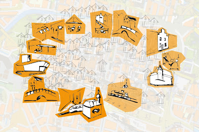
The contrast of the saturated orange color has the highest value at the bottom (where Delft station is visualized). For our eyes this is the first focus point and that is a strong aspect of the total image; from that point the image is 'read'. From this point a direction is chosen to follow the circular based route.
 The grouping of the 'normal' houses creates attention points for our eyes.

Our first determined aspect for our map was that we do not want to show a 'real map' with roads. Situating the buildings in a correct circular shape simulates the 'road to follow'.
We want to play with opacity and grouping to guide people.
2 Delft-routes

One route in Delft is based on culture, the other on commerce. We want to guide people based on the visuals of the poster, and not based on the destination (culture or commerce in this case).
That is why we have chosen for abstract visuals. In this case we can expand a route without releasing the destination of it. donderdag 10 maart 2011
Concept Delft Route
Hello again!
Today we decided on which visal queries to implement to guide visitors towards the museum route or the shopping route.
Of course we're not going to tell you which visual manipulation techniques we will use, because then you would be prejudiced.
Tuesday next week we will publish our concept online and see whether our intentions worked out.
For now we leave you with a visual puzzel; the wellknown Where is Waldo poster. Have fun!

dinsdag 8 maart 2011
Update assignment 2
Unfortunately there is more than just spring and a nice sunny day; we have to study! Therefore we had a meeting today to make some things clear for this second assignment of Visual Communication Design.
The assignment is to design a map of the city centre of Delft with two routes in it: a shopping route and a museum route.
Today we created a planning for the coming weeks and we wrote some things down for this assignment. Next meeting is Thursday and hopefully we have a couple of nice concepts ready which we can choose from.
Can’t wait to see our nice map of the city centre of Delft, a beautiful city.. Especially when it is sunny! For now we just enjoy the sun, to be continued!
maandag 7 maart 2011
This communicates!
Probably you have seen them somewhere... but have you noticed them?
If you did, the design was good, although you are not a insect....
If you did, the design was good, although you are not a insect....
Designed by coincidence and judged by trial and error.
But since we are not the targetgroup we perceive a diferent message than intended... SPRING!
I spy with my little eye, something.. in 3D!
zondag 6 maart 2011
Assignment 1
Finally the time to post the work we have done a week ago:
Team I has finished and delivered Assignement 1!
Click the link to open it and enjoy reading!
A brief introduction on Assignment 1: We received four images to discuss, each in relation to three chapters of the book "Visual Thinking for Design" by Colin Ware, Morgan Kaufmann publishers 2008.
The images we had to discuss where 2 paintings, a poster and a picture:
 Lautrec
After have done this assignement our eyes are opened. This made us see the world much brighter. Therefore from now on we will post interesting items we discovered now and then.
Hopefully we can open your eyes by this as well!
Enjoy seeing!
chau
Team I has finished and delivered Assignement 1!
Click the link to open it and enjoy reading!
A brief introduction on Assignment 1: We received four images to discuss, each in relation to three chapters of the book "Visual Thinking for Design" by Colin Ware, Morgan Kaufmann publishers 2008.
The images we had to discuss where 2 paintings, a poster and a picture:
 Lautrec
 After have done this assignement our eyes are opened. This made us see the world much brighter. Therefore from now on we will post interesting items we discovered now and then.
Hopefully we can open your eyes by this as well!
Enjoy seeing!
chau
Team I
Abonneren op:
Posts (Atom)


