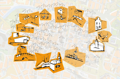
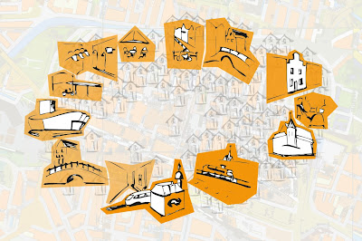
Of corse we are still working on the project...
After the presentation of last week tuesday we got the feedback that we shouldn't use a very obvious color gradient - that is a it too easy. And we could blur the houses to create direction. Besides, where is Waldo?
We have been playing with things like size, filling, background, and facing...
See the results:
^ We changed the size of the buildings a bit, creating a gradient in size and we changed the facing of the front building to make a stronger line directing you to go right.
^ The background more maplike changes the perception, it makes it more clear that it has to do with a route, but the feeling of depth and distancy gets lost a bit
^ Playing with the sizes points the viewer to one side, in this case it should leed you to the left...
Did it work well?
^ To make the buildings a bit more conected and show that it is about a route we added some roads..
Do you think it works?
^ Well, we got the feedback to do some more with the houses... these were just some trials.. we will make them more beautiful and varied... more waldo-like, aproximately....
^ Something like this?
Goodbye!
Friday we will come together to chose a scenario for the movie
The posters will be ready this weekend and will be tested sunday.
:-)


